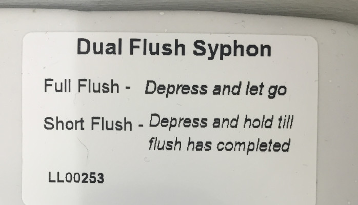
The other day I went to the bathroom in Prufrock’s coffee shop on Leather Lane. (Amazing coffee. Mixed feelings about the ‘latte art’ course). The toilet had a big flush handle on the side. And on the top of the cistern was this sticker:
I’m in a hurry. I’m just gonna go and go, as it were. But obviously it’s impossible for me not to stop and read every single bit of incidental writing the world puts in front of me…
So, I stopped. And I read it. And I couldn’t quite get my head round it. So I read it again. Nope. Still didn’t make sense. So I did a quick mental edit. And then the penny dropped. It’s saying:
For a long flush do a short press.
For a short flush, do a long press.
I actually laughed out loud. It’s such an utterly sublime usability fail. To get the flush you want, you have to do the complete opposite of what feels intuitive. You’d think — if you thought about it at all, which you don’t, which is why it’s important that it’s intuitive — that a short press would give you a short flush, and a long press would give you a long flush,right?
I found myself thinking that even in such a short bit of writing, it’s possible to be really confusing. And it’s interesting that you only truly expose that when you commit to simplifying it as much as possible, and replace the four different terms full and short (note how they’re not even a matching pair),depress and hold, and depress and let go, with the two core concepts: ‘short’ and ‘long’.
And I got to wondering how you could rewrite it. (While also making a mental note to use it as an example of a ‘compensatory mechanism’ in future workshops.) Perhaps you could ignore ‘flush-length’ altogether, and come at it from a user-centric point of view:
Done a wee? Press and hold.
Done a poo? Press and let go.
If I’m honest, I was quite pleased with that. It avoids drawing attention to the whole short/long conflict, removes a layer of processing, and so increases your chances of people picking the right one.
And I was just finishing off with a bit of a ponder about how you’d probably have a hard time getting a client to sign off the words ‘poo’ and ‘wee’ because they sound childish, yet actually any other alternatives either sound medical (‘urinate/defecate’) or rude (‘piss/shit’), and how the meeting where you needed to thrash that out would be one of those brilliant out-of-body ‘this is my actual job’ moments, and I was just getting my phone out of my pocket to take a picture (because: tweetable) when I had a complete toilet usability epiphany.
In a flash, I realised that for probably at least a decade, I haven’t actually known how to flush a toilet properly. And I wondered if it was the same for everyone else.
And it’s because a lot of the time these days, toilets have flushes that look like this (apparently they're known as 'dual flush plates'):
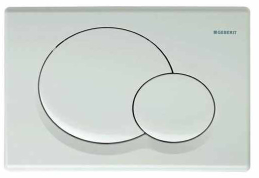
There are variations on this — sometimes they’re little buttons with a small and a large crescent. Or there’s the inside/outside ring design, which even more confusingly implies the normal thing to do is press them both together.
And every single time I’m faced with one of these, I realise that I have exactly the same micro-second long internal dialogue. Imagine I’ve had a wee/urinated/had a piss. It goes:
‘So, right, there’s a choice of two flushes. I want the quick flush one. So that’ll be the small button, because ‘small’ and ‘quick’ are conceptually equivalent… BUT WAIT! What if the buttons are sized according to frequency of use, and the big button is there because that’s the one that gets used all the time, so they’ve made it the no-brainer-can’t-miss-it-cos-it’s-massive one? And oh no now my hand is practically at the panel and I’ve got a split second to decide and ohscrewitI’lljustpressbothtogether.’
That’s what usability designers might call the point of ‘cognitive overload’.
And yes, perhaps it’s a bit mad that I’ve been over-thinking this for all these years, but it’s also true that given the available information, it’s impossible to work out which one is correct. Both options work and don’t work in equal measure. ‘Conceptual equivalence’ and ‘ease of use’ are both perfectly reasonable heuristics.
So, I did two things:
I cleared up the confusion for myself once and for all.
I went and found a toilet with these buttons, and I deliberately pressed each in turn. Turns out, the small button gives you the short flush. The big button gives you the long flush.I asked lots of other people how they thought it worked.
And that was genuinely revealing. Because out of 20 or so people that I asked, none of them had really thought about it at all. All thought that the answer was ‘common sense’. And they were exactly split 50/50 between those who thought common sense was small/short, and those who thought it was big/most used.
And it also made me think this:
I find this funny and fascinating because a) I’m a writer, b) I’m a bit of a heuristics geek. But there’s also clearly a serious environmental thing going on here: if we work through the consequences of 50% of all users of dual flush toilets mistakenly pressing the ‘long flush’ button instead of the ‘short flush’ button every time they use the loo, then we’re clearly wasting millions upon millions of gallons of water every single day.
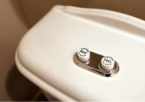
Update: A friend of mine in New York has pointed out that the Ace Hotel has this cistern (below) made by Australian company Caroma. Respect.